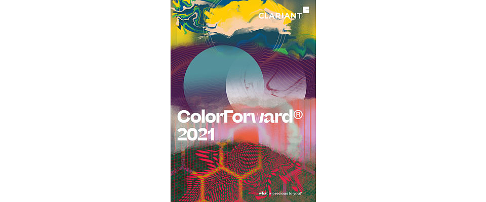
The color experts at Clariant ColorWorks® have identified four societal trends that can be expected to influence consumers in the next few years. ColorForward 2021, the 15th edition of the annual Clariant color forecasting guide for the plastics industry, recognizes that genuine human contact is actually becoming a luxury in the digital era, and that people crave authenticity in a world of deep fakes. On a more positive note, technology is being used to create products that connect with people on an emotional level, while collaboration is seen as critical to realizing positive change.
“These trends lead to a color palette for 2021 that exhibits contrast,” reports Judith van Vliet, ColorWorks Senior Designer and leader of the ColorForward team. “On one side, we see colors that speak to what is relatable and still considered authentic, while on the other side, colors mirror today’s drama. Where the 2020 palette was characterized by cooler colors, the 2021 hues are much warmer and deeper. Moreover, this year’s color directions include many translucent shades, often incorporating special effects or sometimes looking like one thing but feeling like another.”
In ColorForward 2021, as in previous editions, each trend theme is represented by five colors that people are expected to respond to in the coming years. This unique tool can then be used by plastic product designers and marketing professionals to make more informed color choices for new products and packaging.
“Where greens ruled 2020,” van Vliet continues “warm oranges and yellows seem to be taking over in 2021. Blues and greens remain important, ranging from deep nightly hues to softer aquatic tones. Brights have an artificial feel and are juxtaposed with enchanting darks. The lilacs from the last edition have developed into deeper versions of themselves, adding mystery and depth to an overall lively range.”


